


HNWB
Het Nieuwe WOZ-bureau
December 2023
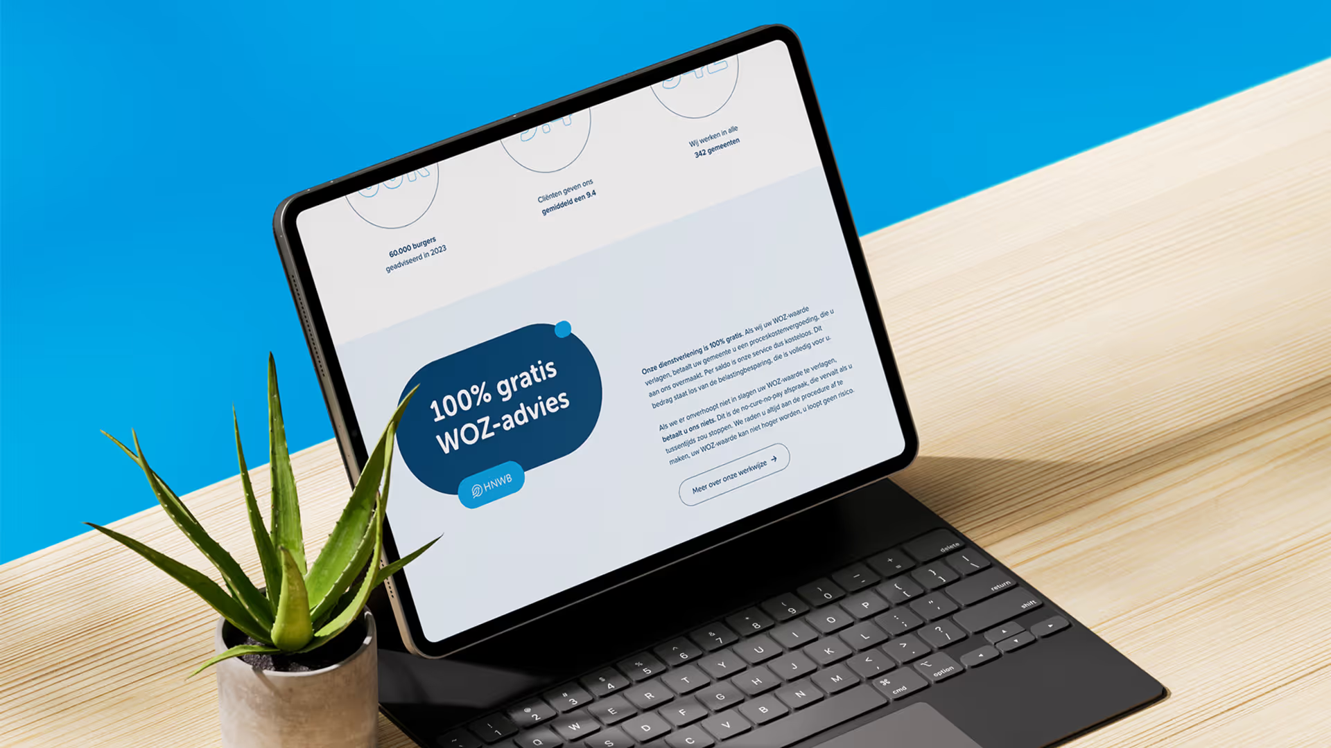
In 3 weeks, we developed new branding and a website for HNWB. Sleek, modern, and friendly, it's ready to help people save on their WOZ-taxes.

De uitdaging.
Het Nieuwe WOZ-bureau (parent company WOZwet.nl) approached us to develop a new brand identity and website for HNWB. The brand needed to appear approachable and friendly, while remaining professional and trustworthy. The website had to serve multiple purposes: attracting new talent, informing about services, and encouraging visitors to perform a free WOZ-check. Simultaneously, HNWB wanted to showcase its team and delve deeper into white-label and affiliate opportunities.
Additionally, there was the challenge of quickly creating a consistent visual identity that would distinguish and make the brand recognizable. The existing image was no longer sufficient, with a logo and brand identity that appeared less accessible and modern. The goal was a friendly, modern look that exuded trust and effectively appealed to both business and new target audiences.

Details.
De oplossing.
During a brief brainstorming session, it became clear that HNWB needed to appear friendly yet professional. We designed a new brand identity featuring a sparrow as the emblem, rounded shapes, and a color palette of blue tones, combined with 'rounded' fonts. These elements created an accessible and modern look, while preserving the brand values. This resulted in a visually coherent brand that is immediately recognizable and aligns with HNWB's mission.
For the website, we first developed a wireframe with a logical user flow, clear CTAs, and scannable content. Photography of the HNWB team conveyed a collegial atmosphere and appealed to the target audience of new talent. By then building the site in Webflow and adding subtle animations, an interactive and modern experience was created. This allowed us to launch a new brand identity and website in just three weeks that is both visually appealing and functionally effective.

Het resultaat mag er zijn.
Review.
4.8 uit 21 reviews op Google Business