


DID
DID thinks to do.
November 2025
A deliberate brand upgrade for real estate developer DID with modernized branding, a future-proof Webflow website, and a buzzing launch campaign.

De uitdaging.
DID is an established name in sustainable area development, but the brand felt cold and technical. Internally, it was applied inconsistently, communication lacked coherence, and the brand's intended story wasn't fully conveyed. They wanted an identity that was human, recognizable, and future-proof – one that truly showed who they are, what they stand for, and what sets them apart. Everything needed to be right, from visuals to tone of voice, so that partners, residents, and colleagues would immediately understand what DID represents.
The existing website and communication tools didn't adequately convey DID's story. Photography and visual elements were scattered, the online presence felt static, and it was difficult to apply everything consistently internally. The brand needed to become powerful, open, and people-centric – an identity that is embraced internally and makes an impact externally. In short, a brand that stands strong and is ready for the next phase of growth, without losing DID's essence.

Details.
De oplossing.
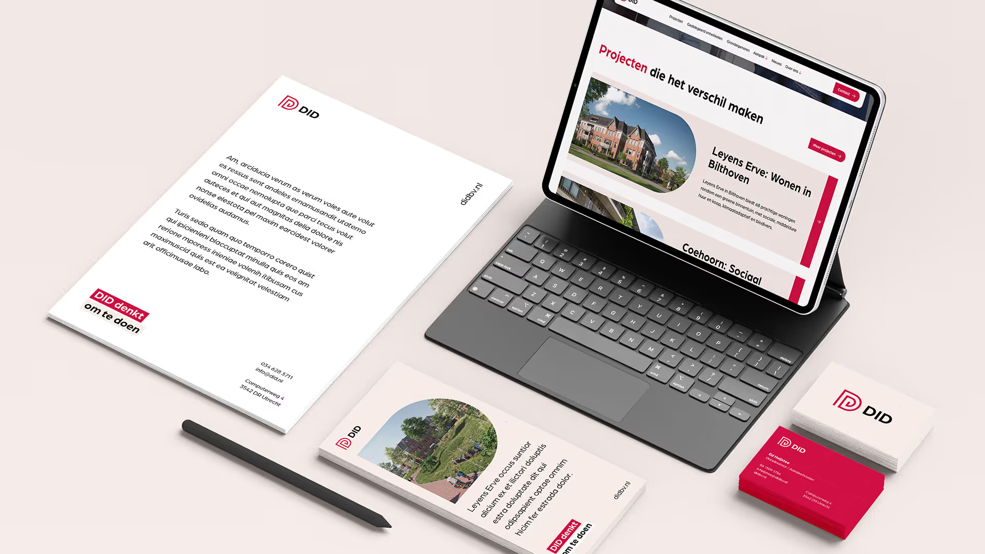
Together with the team, we truly explored the brand and branding truly explored. What makes DID unique? How do you convey mastery, people-centricity, and commitment without it sounding like marketing jargon? The result is a sharp brand story that resonates in every expression. The visual identity received an upgrade: typography is calmer, the line system is flexible, and colors add warmth. The D-shape, iconic for DID, was given a central role in the design language, ensuring recognition across all communications.
Additionally, we translated the brand into practical tools and resources that the team can use immediately. The template system for presentations and documents ensures consistent internal and external communication, photography captures the craftsmanship and collaboration within the team, and the launch campaign showed that the brand is renewed yet familiar. Every touchpoint, from social media to physical construction banners and beach flags, now tells the same story. The result is a powerful, people-centric, and future-proof brand, ready to impress partners, residents, and colleagues.

Het resultaat mag er zijn.
Review.
4.8 uit 21 reviews op Google Business