People-centered development for real impact
The challenge
DID is an experienced developer with a strong name in the sector. The organization has been building sustainable, vital and livable areas for years. The brand's foundation was firm, but the look could be more modern, consistent and people-oriented.
The identity sometimes felt technical and compact, and communication lacked a clear, shared story. The website was outdated, the visual language was unclear and internally, the brand was used in various ways.
In short: the brand knocked, but didn't tell the full story of who DID is today, and where it's growing towards.
It's up to us to sharpen the brand while respecting the existing foundation and providing DID with a recognisable, warm and professional look and to manifest this visually, strategically and digitally.
Getting started
We started with a series of branding and sparring sessions where, together with the team, we re-identified the heart of DID. What characterizes the organization? What makes DID different? And what promise does the brand make to partners and residents?
This resulted in a sharpened brand story that revolves around mastery, people-orientation and responsibility. A story that fits the way DID works: carefully, involved and with an eye for quality.
The next step was to modernize the visual identity. No total rebranding, but a targeted upgrade that makes the brand more open, calmer and more professional.
We balanced typography, developed a flexible line system and introduced supportive colors that add warmth to the existing DID red. The characteristic D-shape also played a structural role within the design language.
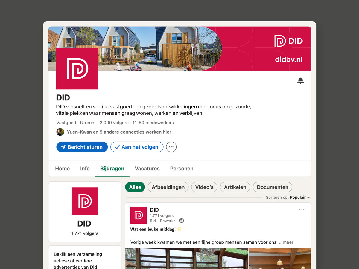
Digital communication also received an update. From LinkedIn to project presentations: clear frameworks, consistent typography and calm layouts ensure familiarity and professionalism everywhere.
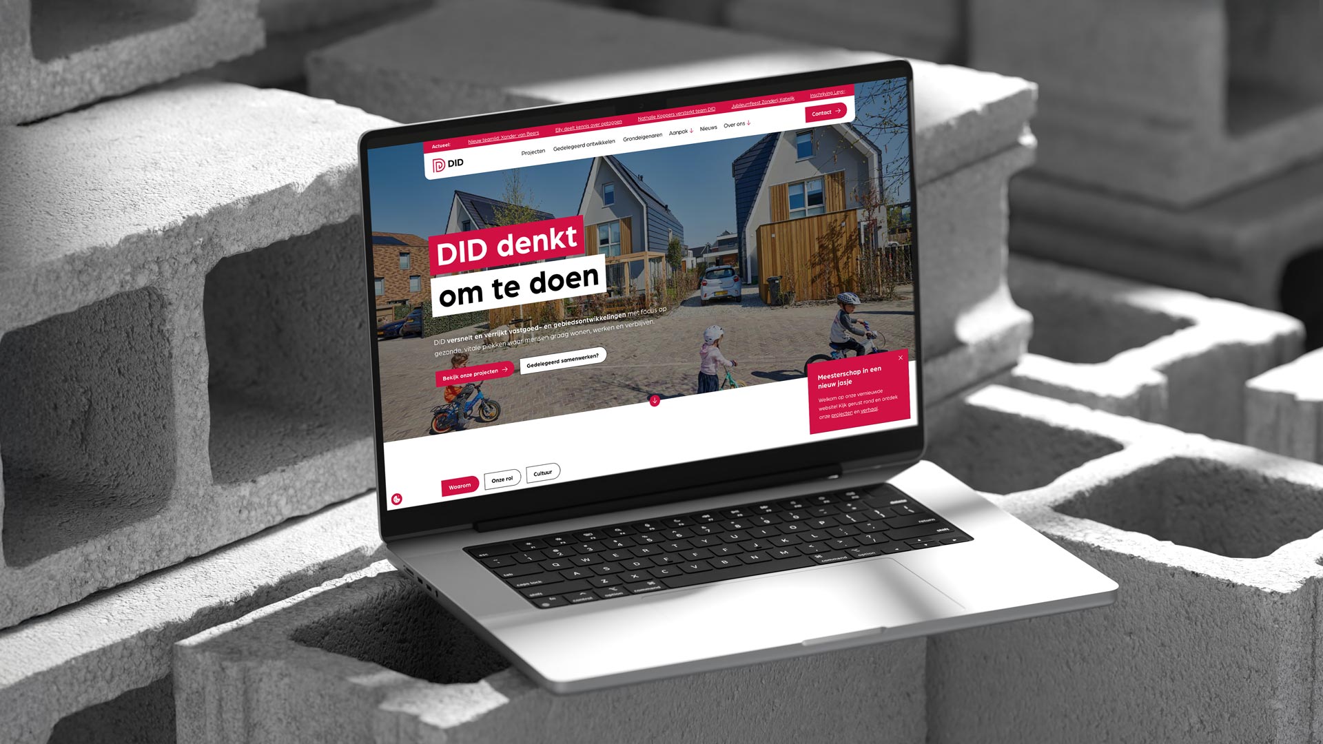
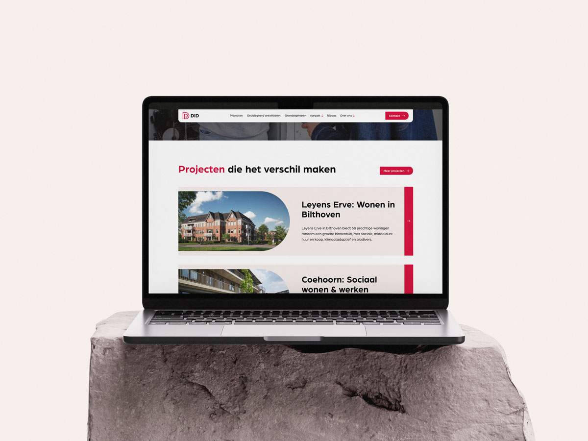
With the renewed identity, we worked towards a completely new website. We started with wireframes in which we thought about the ideal flow for visitors: a clear project overview, a powerful “About DID” story and a modular system that can fill the team flexibly.
The design is spacious, quiet and people-oriented. Photography plays a bigger role, and the interface feels modern but understated. The website is built entirely in Webflow, with flexible CMS components.
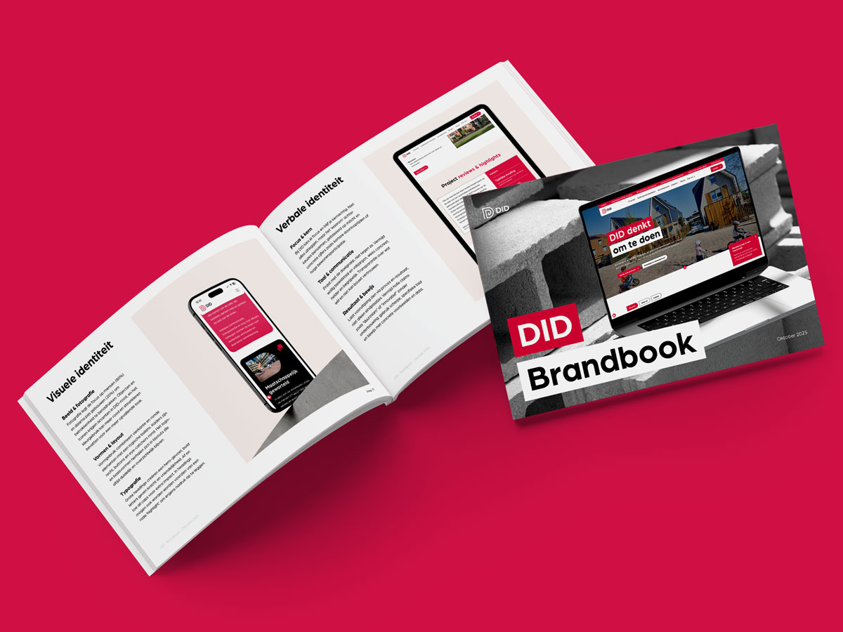
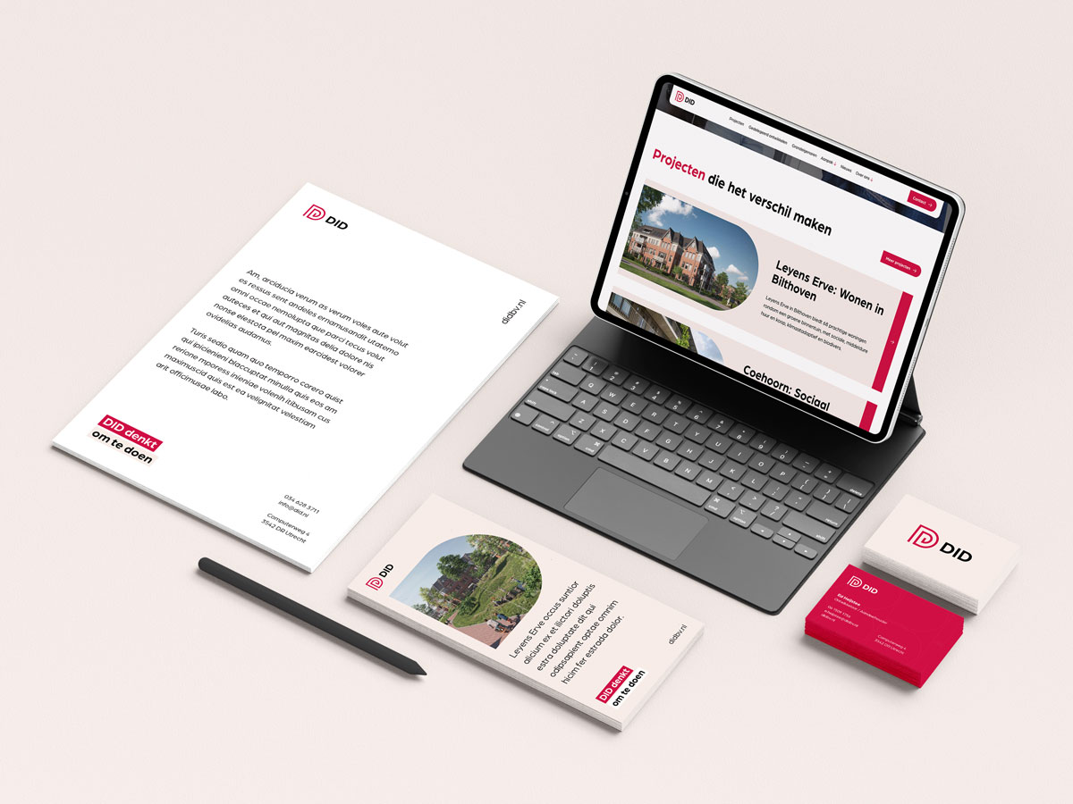
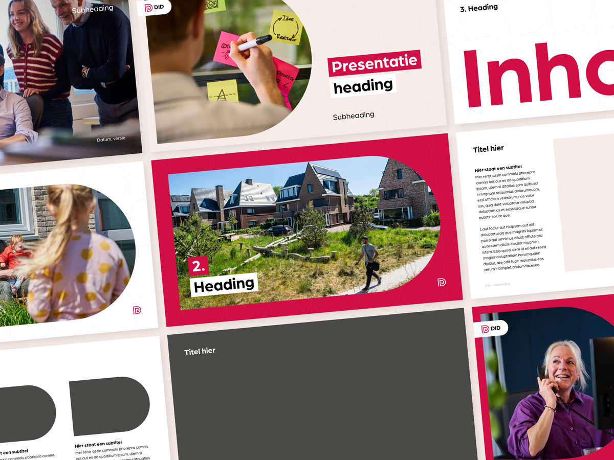
To make the brand easily scalable internally and externally, we developed a complete template system. From presentations to quotes and documents: everything now fits seamlessly with the renewed visual identity.
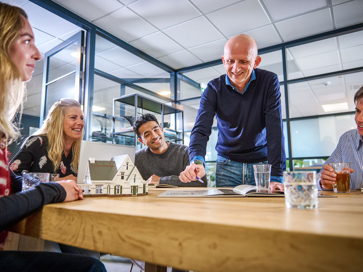
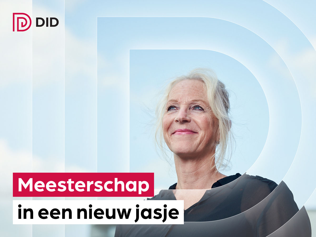
To highlight DID's humanity even more strongly, we supervised a photo shoot with a focus on collaboration, craftsmanship and engagement. We recorded moments at the office, during meetings and in contact with residents.
Finally, we helped DID with a strong, compact launch campaign. From social visuals to web-introducing elements: a clear announcement that the brand has been renewed but remains recognisable.
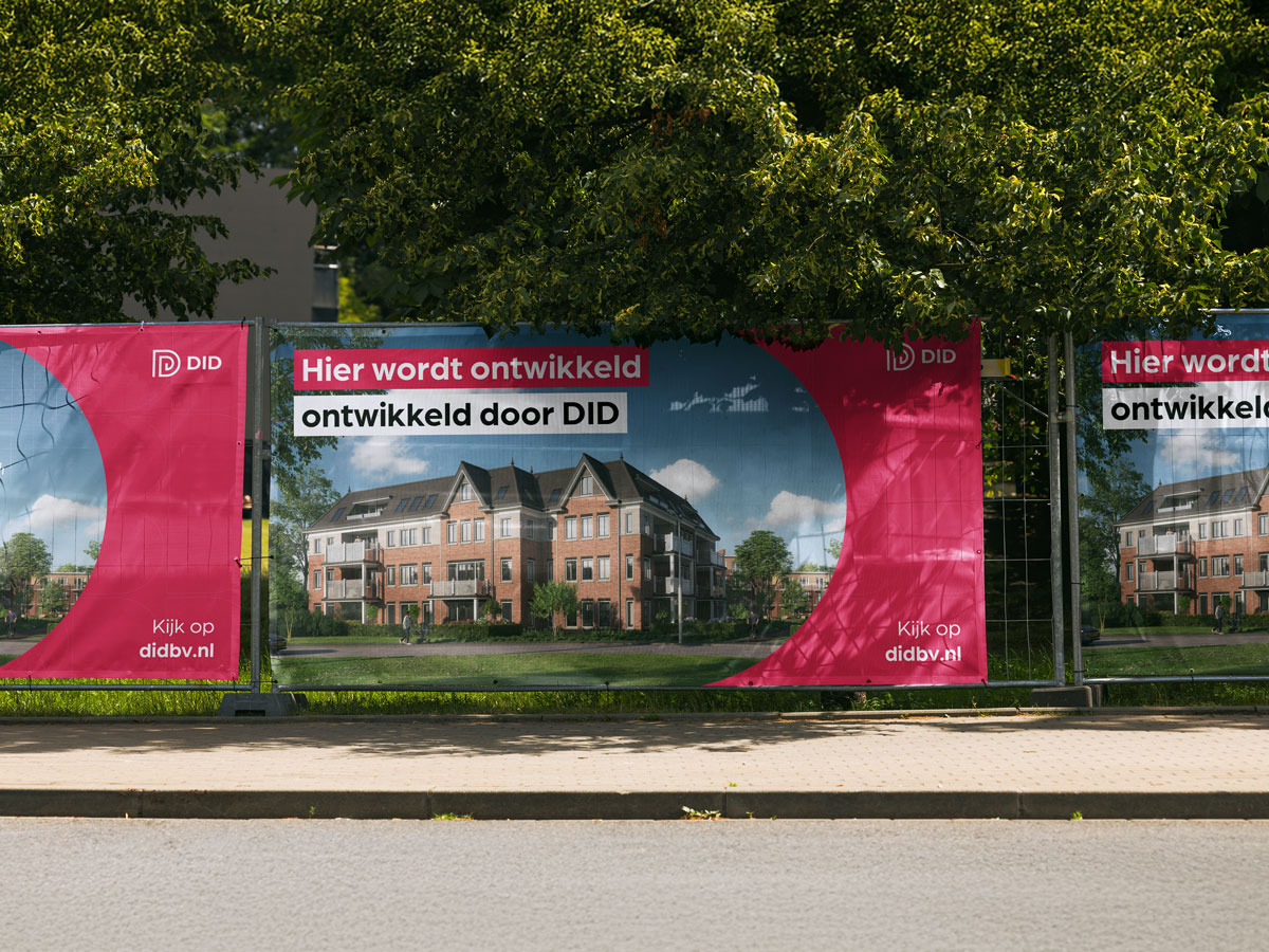
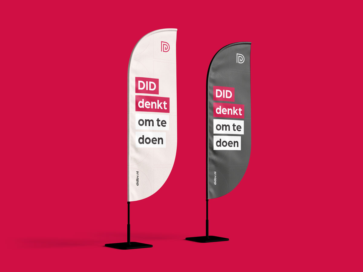
And of course, the beach flags were not to be missed. These mobile carriers are often used at events, locations and project moments, and are therefore an important visible brand carrier. With the renewed style, the beach flags have become a powerful, bright and striking element.
By bringing strategy, design, website, photography and templates together, we've made DID a brand that is more powerful, consistent and future-proof. An organization with a recognisable and professional look for municipalities, partners, residents and new colleagues.
All in all: a brand that is ready for the next phase of growth, but remains firmly anchored in the values that DID has always stood for.
A positive customer review

DID
Results achieved
Een striking brandlaunch
A brand that sticks

.avif)