Improving neighborhoods together, smarter and faster
The challenge
BuurtBoost is an initiative by VORM and DID Vastgoedontwikkeling, focused on making existing (post-war) neighborhoods future-proof – with attention to both physical and social aspects.
The concept was strong and distinctive, but the brand identity lacked clarity and cohesion. Communication could be more consistent, and the use of color and form left room for improvement. The team recognized the brand’s potential but lacked a clear, shared direction.
We were given the exciting challenge to help shape a focused strategy and develop a strong, mature, and recognizable identity for BuurtBoost – both visually and digitally.
Getting started
A strong brand starts with a sharp strategy. That’s why we kicked off with a series of creative brand sessions in which we redefined BuurtBoost’s identity together with the team. This led to a clear and powerful brand story, centered around the core message: Together. Smarter. Faster. — a mantra that perfectly sums up BuurtBoost’s approach.
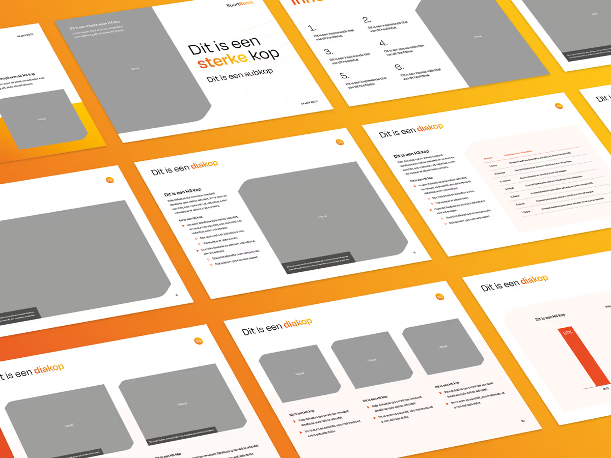
The next step was developing a matching visual identity. The visual style is built around the transition from old to new. We created a graphic system where red, descending shapes gradually transform into yellow, rising ones — a strong visual metaphor for neighborhoods coming back to life. The color palette was intentionally simplified to a more balanced and trustworthy selection, and the overall design radiates calm, clarity, and energy.

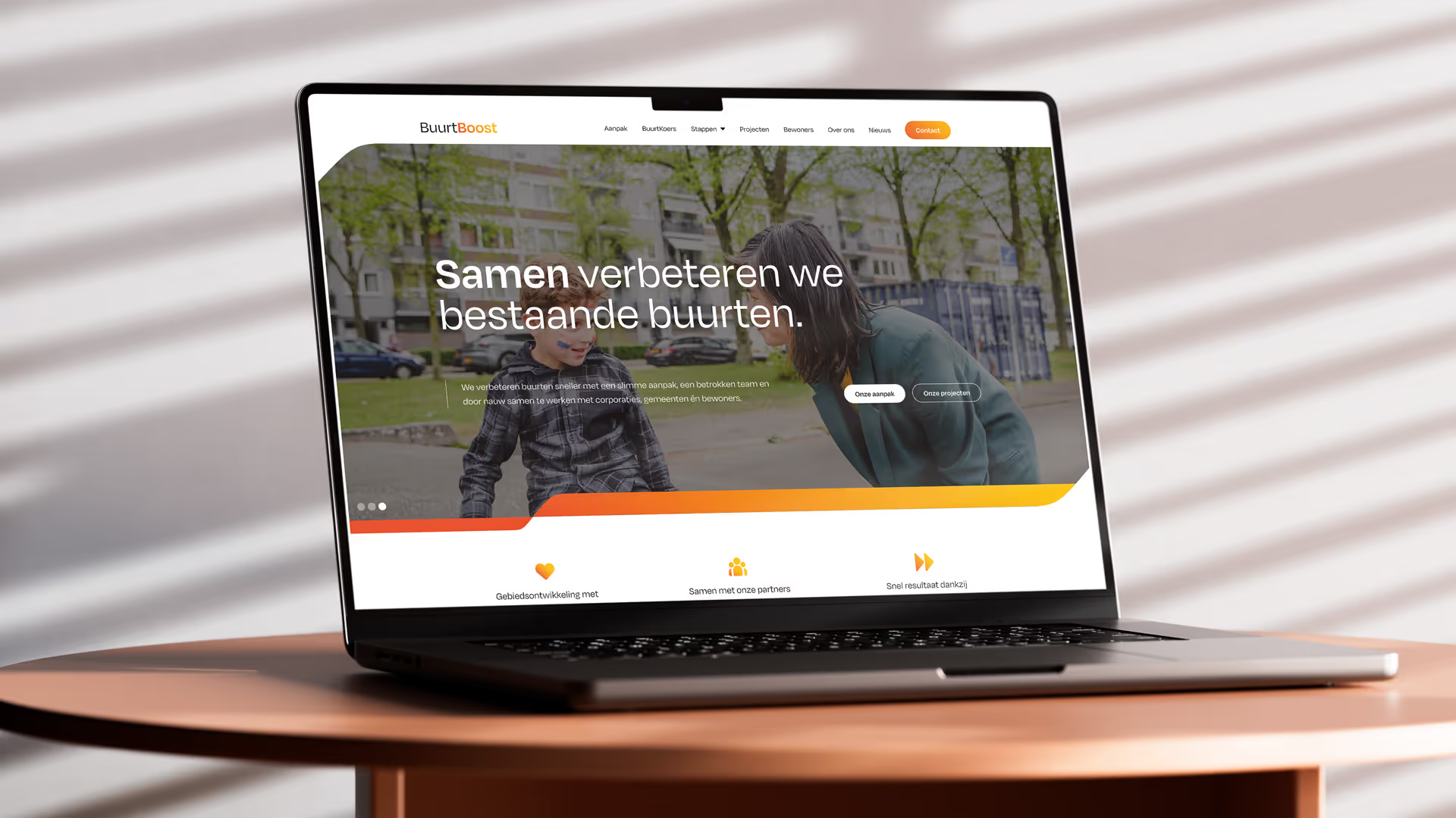
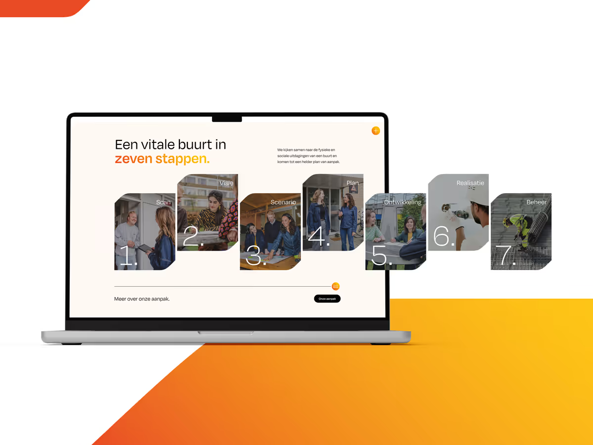
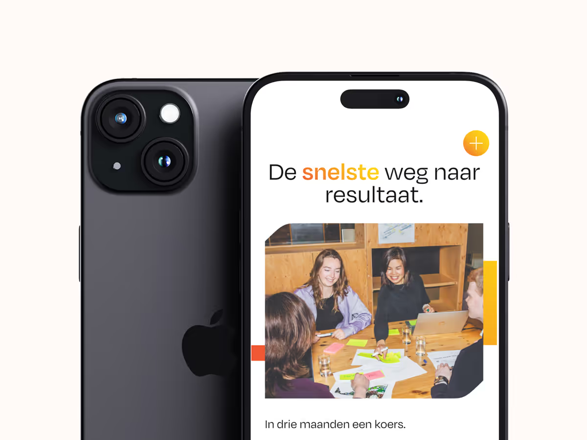
With the new brand identity in place, we began designing a new Webflow website. We started with wireframes that mapped out the right flow, structured the approach, and clearly communicated the various "boosters" such as BuurtKoers, BuurtPeiling, and BuurtPlatform. The storytelling throughout the site is light and accessible, with plenty of room for visual elements. Subtle animations help the site feel modern, without becoming overwhelming.
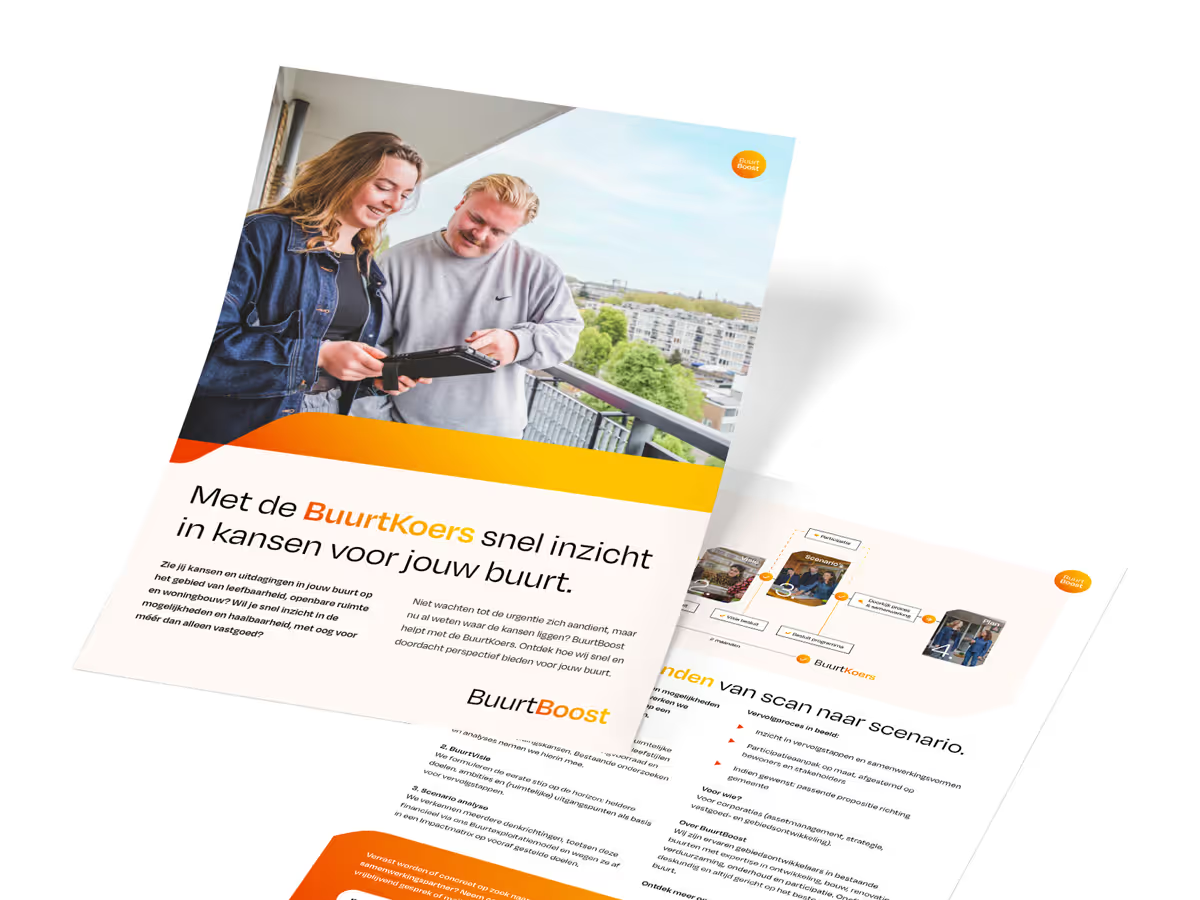
To bring the BuurtBoost team to life exactly as they are – driven, ambitious, authentic and fun – we collaborated with photographer Saskia Bakker to capture them in action. We joined them during a brainstorm session, out on the streets, and in the heart of neighborhoods where they interact with residents. The result is a series of vibrant, honest portraits and dynamic moments that reflect the energy and commitment of the team. The photography adds a human touch to the brand and makes their mission feel real, relatable and grounded in everyday impact.
By combining strategy, design, and seamless interaction, we shaped BuurtBoost into a brand that communicates the right message — to residents, municipalities, and housing corporations alike. The result: a recognizable, professional, and engaged brand that’s ready to future-proof neighborhoods.
A positive customer review


BuurtBoost
Results achieved
A brand that reinforces social impact
A brand that inspires trust


